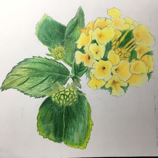
This is the picture I used for my project. I took it at Corte Madera town park near the Corte Madera post office. I chose it because it was challenging but it had good lighting and it had a lot of detail which I liked it. I kept myself challenged by choosing this picture in general, it was something I had never done before but wanted to try.
I chose this composition because I thought it framed the flowers well and had a good color scheme. I chose to use a grid to draw this project because it had a lot of detail in it and I thought it would be hard to get correct proportions with using just my observational drawing skills. Something that was really challenging for me in this project was getting the flower shapes correct and getting the coloring correct. I didn't have much time to color in class so I ended up taking the drawing home and I hadn't brought home the right yellows that I wanted to use so it made it more difficult because I had to use colored pencils that were a bit difficult to work with. Something that I found really successful in this drawing was the shading on the leaves that I did, I love the lighting on them and I think they really look like leaves. For this project I used an analogous color scheme. I feel like this picture looks as if it was early in the morning. To help my colors blend in the flower and the leaves I used the colorless blender. In this drawing I also used the rule of odds putting 5 leaves in and putting three flower buds. Something I would have done differently for this project is I would have taken more time at home to work on coloring the background as well as putting in more detail. I would have also if I could have, I would have chosen a different picture because I think that this picture was really hard to work with for the level of experience with drawing I have. Other than that I am very happy with how my project turned out.


I love all the colors you used in the green leaves- they create great values and make the leaves look more realistic. I wonder if you did a little more orange in the shadows of the yellow flowers they'd look more 3D...
ReplyDeleteI'm glad you like the composition, but why? What rules does it follow, what intentional choices did you make about the placement of the flowers and the leaves?
Don't forget to answer all parts of the prompt! For instance, what are the principles of design you used, how and where? Respond in the comments below.